Creating a website doesn't have to be expensive or complicated. You can use a website builder like Wix or GoDaddy to get started quickly without spending hundreds of dollars on a custom design.
In this article, we've listed 10 beautiful website design examples of hair salons across the globe to help you get inspired and start attracting customers online.
Let's take a look.
» Did you know you can create a beautiful website for your hair salon quickly and easily with a website builder? Check out our top picks for the best website builders to find one that suits your needs.
1. Glasshouse, London: Stylish, Minimalistic Design
Glasshouse has a sleek, minimalistic website in which white space is used generously to attract the visitor's eye to the navigation menu at the top of the page. It has everything a hair salon needs: a booking page, gallery, price list, and a spot for the salon's address.
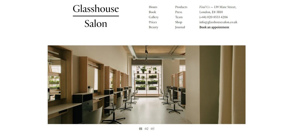
There's also a page where visitors can find out more about each team member and an online store where you can buy the salon's selection of organic beauty products and stylish gifts. The way the online store is integrated into the salon's site is impressive, and the execution is impeccable.
» Learn the basics: How to build a stunning website
2. Salon Envy, Chicago: Well-Structured and Easy-to-Navigate
Salon Envy's homepage features an extensive navigation menu that has no less than nine tabs. Despite the number of tabs, navigation is simple and intuitive due to the well-thought-out and logical menu structure. Social media icons are placed in the center of the page, and the salon's Instagram feed is integrated onto the website.
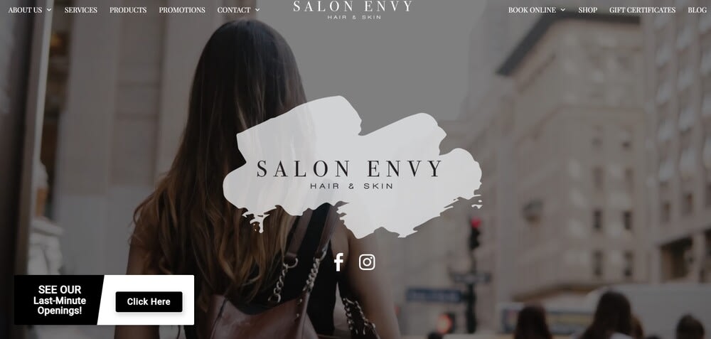
In the lower-left corner, you can see a last-minute bookings widget, allowing visitors to reserve a last-minute rendezvous at the salon. This is a smart way to deal with cancellations or empty slots because it helps the salon make more money and clients find an opening that suits them. Win-win, right?
3. Bartucci, Chicago: Sleek and Stylish Website
Bartucci is another salon in Chicago that has a simple, elegant, and efficient site. The menu structure is much simpler than in the previous two examples, making it super easy to navigate. You can easily find all the info you need: services and prices, contact details, the team page, and the salon's online store for hair products.
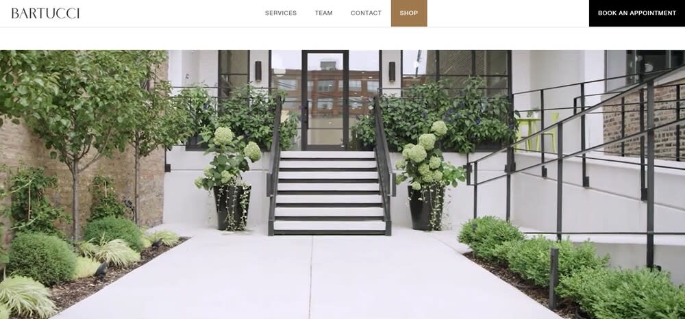
The home page features a video that shows the salon. On the team page, you can meet each team member in a short video, which helps inspire trust and makes the website more memorable.
With a website builder such as Squarespace or Wix, you could achieve a similar result. And if you're not ready to hire a professional videographer, high-resolution photos can help you create an equally stunning result.
4. Picasso Hair Studio, Singapore: Interactive Design
Picasso Hair Studio's website design makes good use of colors and shapes, which helps make it visually attractive.
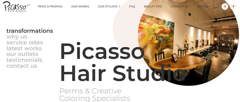
What's even more impressive about it is its interactive transformations page. In it, you can slide your cursor across photos to see clients' transformations, which truly showcases the talent of the salon's stylists.
At the bottom of the home page, you can find testimonials from satisfied customers directly integrated from Google Reviews and Facebook, adding an element of trustworthiness.
5. Fox & Jane, US: Bright and Colorful Website
Fox & Jane's website instantly grabs the eye thanks to its combination of pretty pastel colors, fonts, and animations. There's a lot going on on the home page, but it's still easy to figure out—and its trendy design definitely makes it stand out.
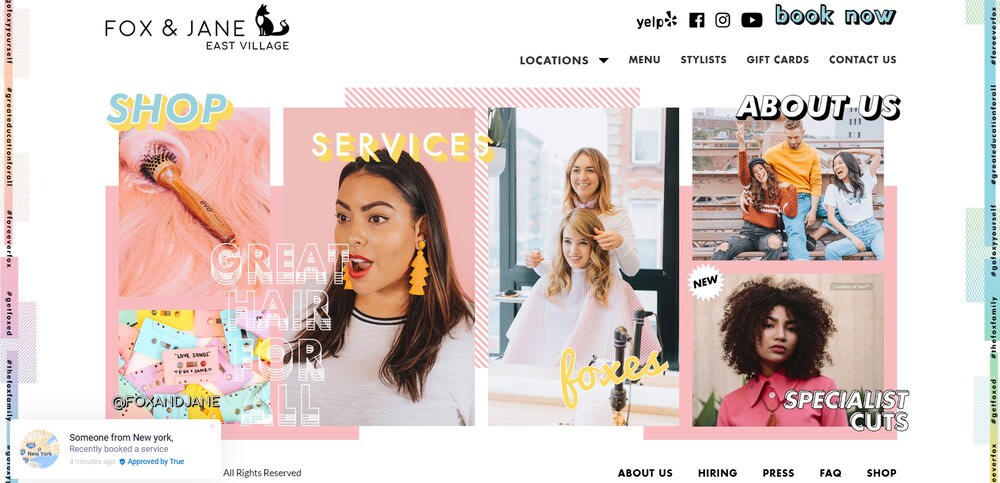
The menu is easy to navigate, with the "Locations" tab occupying a central position and the "Book now" button instantly visible in the upper right corner. Each location opens a slightly different version of the website with photos from the specific salon, and the "Services" page takes us to a detailed pricing page in which everything is thoroughly explained.
6. Josh Wood Color, London: Beautiful and Functional Design
Josh Wood Colour is another website that combines a hair salon page and an online shop in one—and both are very easy to navigate. The salon section has two buttons that stand out: "Book Appointment" and "Gift Cards", which helps visitors find their way around (and most likely helps with conversion rates too!).
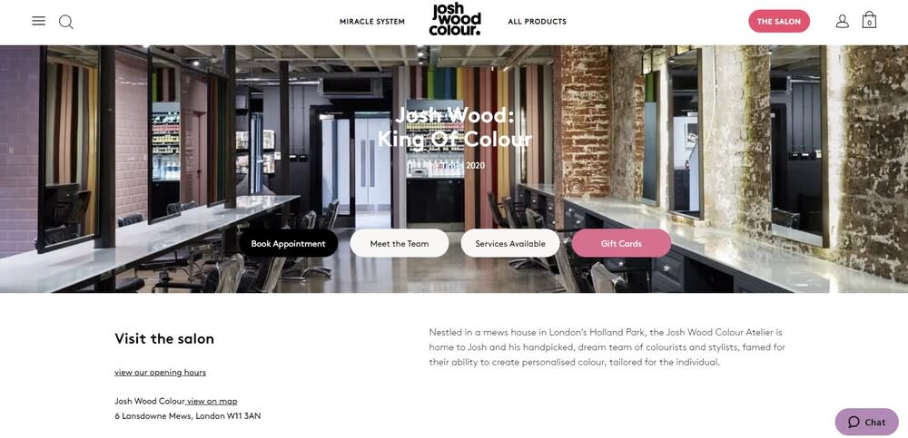
The colors help the design stand out. The combination of black and white helps with readability and makes it look sleek and elegant, while the pink accents make it fun and memorable. Picking the perfect website color scheme might sound like a complicated task, but it becomes much easier once you get familiar with the basics of color theory.
7. Que, Sydney: Minimalist Design
Que takes design minimalism to another level with a website that is super elegant and visually stunning. And the good news is that it's easy to create a similar minimalistic website with a website builder.
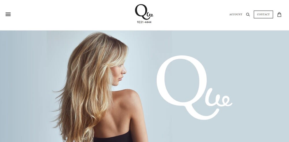
The navigation bar, hidden behind a hamburger menu in the upper right corner, allowing visitors to go to the shop or make an inquiry for a booking.
Like many salons from this list, this one also has its online store categorized according to brands, making it super easy to navigate.
8. Percy & Reed, London: Bright Colors and Videos
Percy & Reed's website is another gorgeous example of using bright colors and videos for an impressive result. What's more, it has a neat "Squeeze me in" widget for instant bookings.
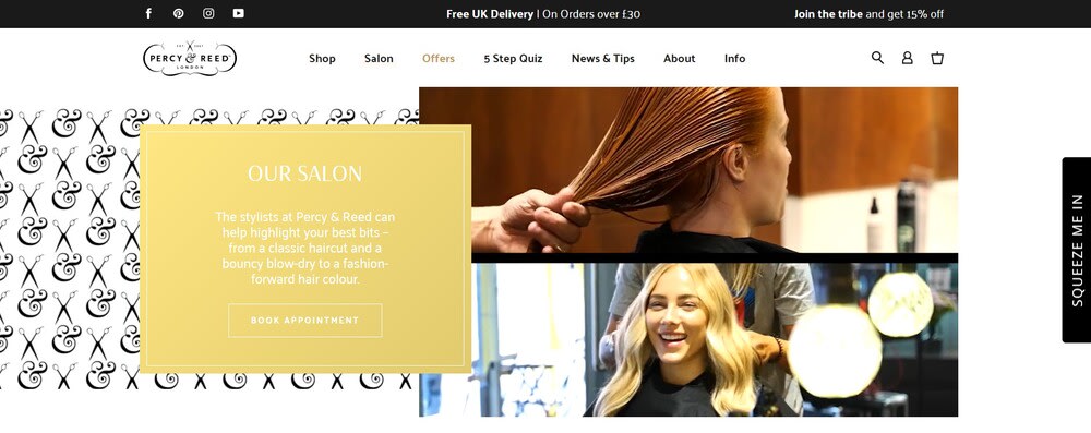
The website also has a blog, which certainly helps with search engine rankings and conversions.
9. George Northwood, London: Tutorials and Behind-the-Scenes-Footage
George Northwood has taken an unusual approach to promoting his salon: creating and maintaining a YouTube channel, which is featured on the website in the "Tutorials and videos" section.
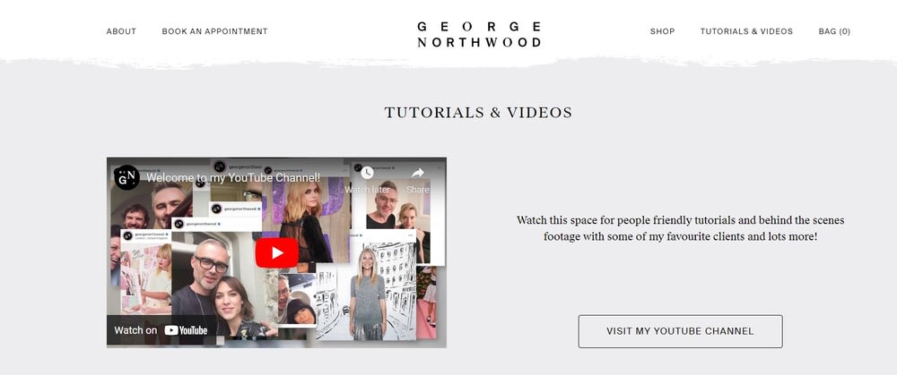
In it, visitors can see how he works and get expert tips and advice, which helps build trust even before booking an appointment. The rest of the website is very intuitive and well-designed, providing an overall positive user experience.
With the right website builder and plugins, videos are easy to integrate and can be a great marketing strategy.
10. Bijin, Prairie Village: Elegant and Colorful Design
Bijin's website is gorgeous, and it's a good example of what you can achieve if you opt for an image-heavy design.
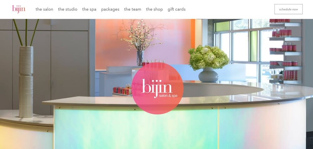
The menu is simple and intuitive, which helps visitors quickly find their way around. What makes the website particularly impressive is its use of high-resolution photos of the salon and its different products.
The "Schedule now" button is instantly visible and takes you to a new page where you can quickly book an appointment.
Creating a Website for Your Hair Salon Isn’t Complicated With the Right Tools
Although some of these designs are certainly custom-made, building a professional website doesn't have to be impossible or expensive, even if you're a beginner.
Website builders help you get started quickly, and many of them enable you to seamlessly add an online store to your site, which is a growing trend among hair stylists.
» Want to set up a tasteful website for your salon? Check out our list of the best website builders for small businesses to get started!

