A landing page is a powerful marketing tool—and website builders make it super easy to set up one. But how effective are landing pages at driving conversions? Well, it varies per industry. For instance, research shows a 5.2% median conversion rate.
So, what does your landing page need to maximize conversions? In this article, we'll look at 10 industry tips that can help you maximize the potential of your site's landing page.
» Short on inspiration? Build your dream site with these expert-backed web design tips.
1. Tell Visitors What's in It for Them
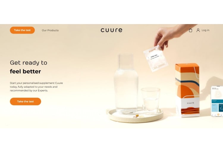
Your landing page should encourage conversions by telling visitors why they should buy your product.
Use a strong value statement for this—and remember to combine it with a powerful, product-specific image, as Cuure did in the above example.
Cuure sells personalized supplements that aim to help you feel better—which is instantly apparent from their landing page copy that highlights personalized, expert-backed recommendations.
2. Talk About the Benefits
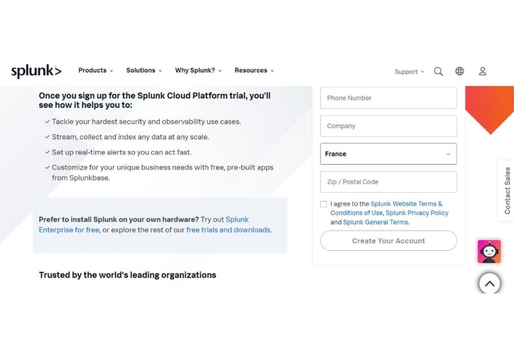
Many people may look for the advantages of using your product before they focus on the technical features. Splunk, a B2B data management platform, as you can see below, knows this.
For B2B products, the technical data is also important, which is why they included it elsewhere on the same page. Still, like Splunk, you can easily boost conversions by piquing the visitor's interest with the upsides first.
» Try using website builders for small businesses to set up landing pages with ease.
3. Use Storytelling to Build Trust
Who doesn't love a good story?
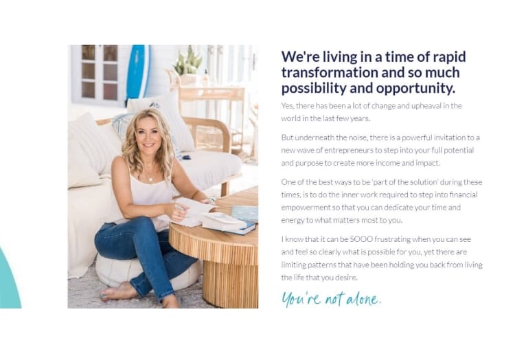
Storytelling is a game-changing way to build a connection with your visitors. It doesn't need to be a personal story about you but can be about people and their struggles. Plus, it's easy to include even if you're building a website on a tight budget.
Denise Duffield-Thomas, a money mindset mentor, knows that all too well. Here, she uses storytelling to establish a genuine connection with her prospects by validating their experience and showing she understands them.
4. Build a Solid Structure
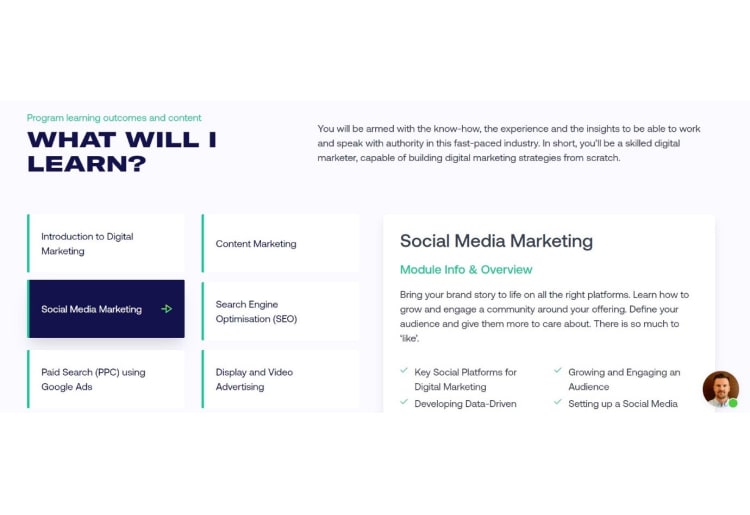
An analysis shows that landing pages with fewer than 100 words convert 50% more than pages with more than 500. So, how you organize information can help create easier navigation for a positive user experience.
Here, the Digital Marketing Institute opted for clickable cards for the different modules of their course, which condenses content in a digestible way:
5. Stick to a Clean, Simple Design
An Omnisend study shows that landing pages have a 23% conversion rate when it comes to customer sign-ups. This is even more effective than other interactive prompts on these pages.
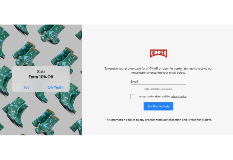
So, making your design overly complicated puts off visitors. That's why you need to leverage the power of simplicity. Camper did this to easily highlight the benefits (a discount) of a sign-up:
» Looking to build simple designs? Draw inspiration from these AI-based websites.
6. Use Social Proof
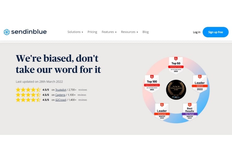
Social proof is an invaluable marketing tool that enables you to stand out in a world full of noise. And it shows—9 out of 10 consumers state they trust reviews and testimonials on landing pages.
Here's a good example from Sendinblue, using customer reviews and industry awards:
7. Introduce Your Team
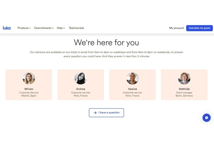
Not every company puts their team forward, especially not on landing pages. Personally, I love it when businesses do just that. It creates trust and makes the whole experience more personal, ultimately boosting conversions.
Here's how Luko, a Paris-based insurance company, does this:
» Your small business website needs to include these important elements.
8. Use One Clear Call-to-Action (CTA) Across the Page
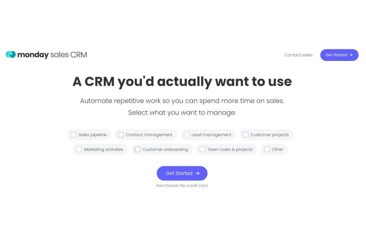
If your landing page is confusing and tries to take visitors in five different directions, you'll inevitably water down your own message. For instance, studies show that landing pages with too many offers can have 266% fewer conversions than single-offer pages.
Check out how Monday's CTA. Their CTA is consistent across the entire landing page and also always sits conveniently in the upper right corner.
9. Only Request the Information You Need
Website speed can affect visits and sales. So, to reduce friction at the first step of the conversion process, stick to the bare minimum and only ask for what you need.
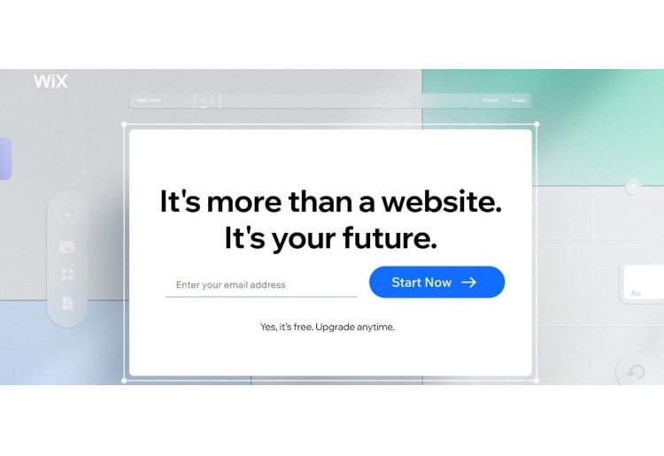
Like what Wix did below. Only an email? That's right—just an email, which makes the whole process look super easy and intuitive. And even if a visitor drops off and doesn't complete all the steps, Wix still has their email address.
» Considering a different platform for your landing page? Explore these WordPress alternatives to find the perfect fit for your marketing needs.
10. Address Visitors' Key Questions
A key part of a potential client's decision-making process is collecting enough information about a product. So, you'll be one step ahead of the competition by answering the most important questions your visitors might have.
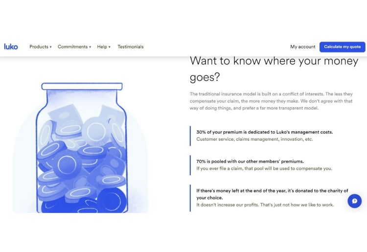
This is especially true for uncomfortable questions most of your competitors aren't answering. No one wants to feel uneasy when they don't know where their money goes. So, Luko is transparent and puts the answer straight up on their landing page.
Build a Landing Page Designed for Conversions
So, by playing around with our design tips, you can build a powerful landing page that'll help you boost sign-up, sales, or other conversions. You should even try variations, like adding videos, which can boost conversions by 80-86%. So, start creating your landing page for better results today.
» Ready to convert visits into sales? GoDaddy and Squarespace can help.

